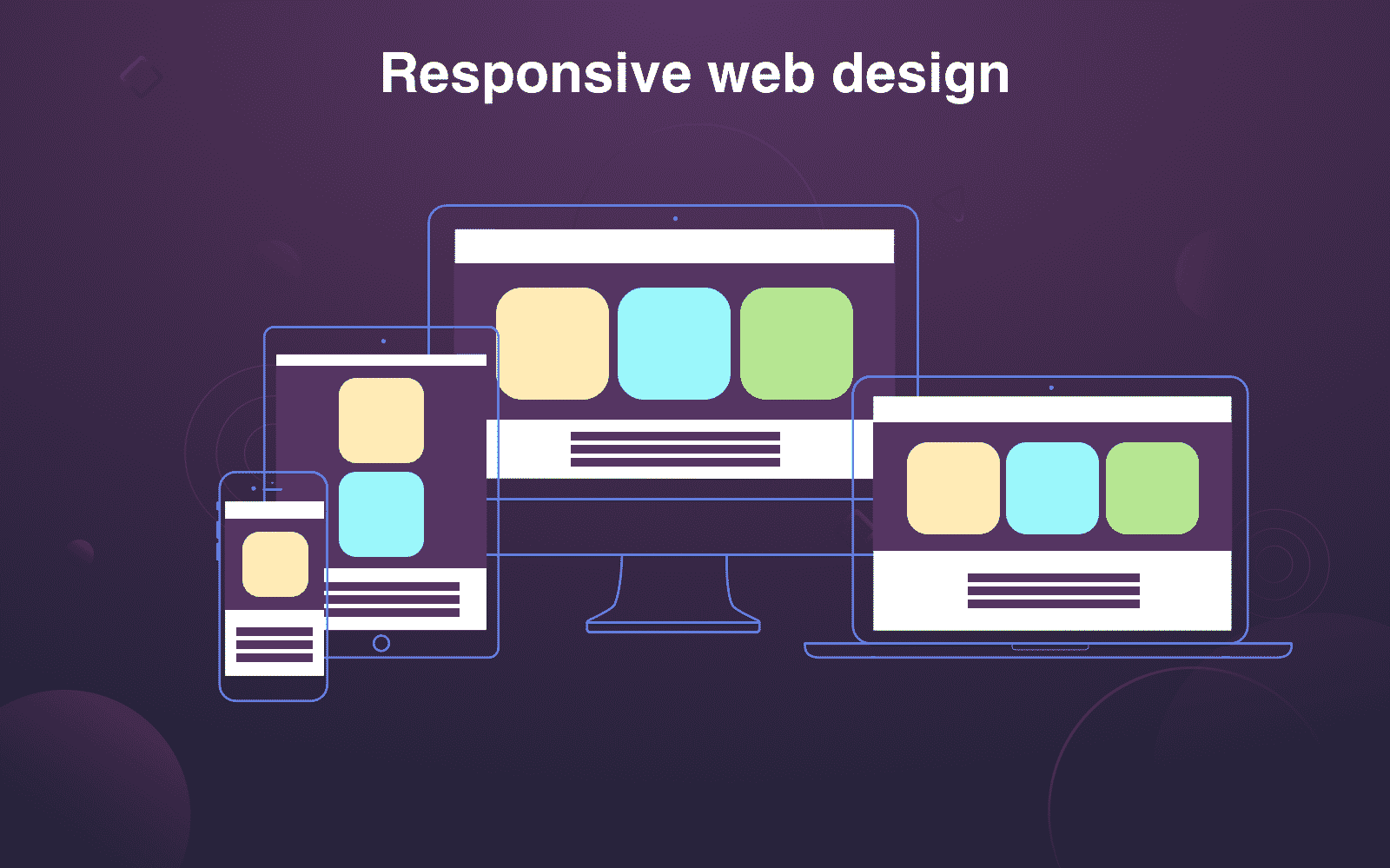
Responsive Design Ruins: Fixing Mobile Responsiveness Issues

Responsive website design is a must-have in today’s digital landscape, where users access websites from various devices with different screen sizes. However, achieving true responsiveness can be challenging, leading to common display issues on mobile devices. Here are some common problems and solutions:
Layout Distortions:
-
Text Overlapping: Content spills over other elements due to incorrect font sizes and line heights. Solution: Adjust text sizes and use appropriate line heights to ensure readability.
-
Broken Layouts: Elements are misaligned or stacked awkwardly, ruining the visual hierarchy. Solution: Use flexible grids and containers that adjust according to screen size, maintaining element positioning.
Image Scaling Issues:
-
Blurry Images: Low-resolution images appear pixelated on high-resolution devices. Solution: Use high-resolution images and optimize them for various screen sizes using techniques like srcset and picture tags.
-
Stretched Images: Images are distorted or stretched to fit the screen, losing their aspect ratio. Solution: Use CSS properties like object-fit and object-position to control image display and maintain proportions.
Navigation Challenges:
-
Tiny Menu Items: Dropdown menus and navigation items become too small and difficult to tap on touchscreens. Solution: Increase menu font sizes, use larger icons, and consider a hamburger menu for space optimization.
-
Horizontal Scrolling: Content exceeds the screen width, forcing users to scroll horizontally. Solution: Use flexible containers that shrink content to fit the display, eliminate unused white space, and simplify the layout.
Other Common Issues:
-
Slow Loading Times: Websites take a long time to load due to large image files or poorly optimized code. Solution: Optimize image sizes, use lazy loading techniques, and minify code to improve performance.
-
Unresponsive Buttons: Buttons fail to respond to touch or are too small to interact with. Solution: Increase button sizes, provide ample spacing around them, and ensure they display correctly on all devices.
-
Broken Tooltips: Tooltips appear in the wrong location or are cut off by screen edges. Solution: Position tooltips strategically, use CSS to control tooltip placement, and consider using alternative methods like inline help text.## Responsive Design Ruins: Fixing Mobile Responsiveness Issues
Executive Summary
Responsive design has revolutionized web browsing, allowing websites to adapt to any screen size or device. However, poorly executed responsive design can lead to a myriad of issues that hinder user experience and SEO performance. This article explores common responsive design pitfalls and provides comprehensive solutions to address them, ensuring seamless user experiences across all devices.
Introduction
In today’s mobile-first world, it’s imperative for businesses to ensure their websites provide an optimal experience on all platforms. Responsive design is designed to address this need, but careless implementation can lead to significant problems. By understanding the potential stumbling blocks and adopting effective solutions, website owners can avoid these pitfalls and create responsive websites that meet both user and search engine expectations.
FAQs
Q: Why is responsive design important?
A: Responsive design ensures that websites render correctly across all devices, providing a consistent user experience. It improves SEO performance, search engine rankings, and overall customer satisfaction.
Q: What are the key principles of responsive design?
A: Responsive design principles include flexible layouts that adapt to different screen sizes, fluid images and fonts that scale proportionately, and touch-friendly navigation elements.
Q: How can I test the responsiveness of my website?
A: Use tools like Google’s Mobile-Friendly Test, BrowserStack, or Responsive Design Tester to check how your website looks and functions on various devices and screen resolutions.
Common Responsive Design Pitfalls and Solutions
1. Slow Loading Times
- Problem: Due to poorly optimized images, scripts, or excessive content, the website loads slowly on mobile devices.
- Solutions:
- Optimize images for web using compression tools.
- Reduce unnecessary scripts and code.
- Minimize the amount of content loading on mobile devices.
2. Usability Issues
- Problem: Navigation menus, buttons, and text become too small or difficult to use on mobile devices.
- Solutions:
- Ensure touch-friendly buttons and navigation elements.
- Use legible fonts and font sizes for mobile screens.
- Provide ample spacing between interactive elements.
3. Layout Breakages
- Problem: Page elements overlap or are misaligned on different screen sizes, resulting in a broken layout.
- Solutions:
- Use flexible grids and layouts that respond to device width.
- Set breakpoints to define how content should be arranged on different screen sizes.
- Employ media queries to adjust element positioning and styles based on screen resolution.
4. Inconsistent Content
- Problem: Important content disappears or is rearranged on mobile devices, leading to information gaps.
- Solutions:
- Prioritize content hierarchy based on device viewport.
- Use responsive grids and layouts to ensure content is visible and accessible.
- Test the website on multiple devices to verify content consistency.
5. Accessibility Issues
- Problem: Color contrast ratios, font sizes, or interactive elements are not optimized for accessibility guidelines, limiting the experience for users with disabilities.
- Solutions:
- Maintain appropriate color contrast ratios for text and backgrounds.
- Use readable font sizes and styles.
- Ensure keyboard navigation works effectively for all elements.
Conclusion
Responsive design, when implemented correctly, enhances user experience, boosts SEO, and drives business growth. By addressing common pitfalls such as slow loading times, usability issues, layout breakages, inconsistent content, and accessibility issues, website owners can create responsive websites that provide a seamless experience on all devices. Embrace these solutions and watch your website thrive in today’s dynamic digital landscape.
Relevant Keyword Tags
- Responsive web design
- Mobile website optimization
- User experience
- Usability
- SEO performance
