Creating User Interfaces with Accessibility in Mind
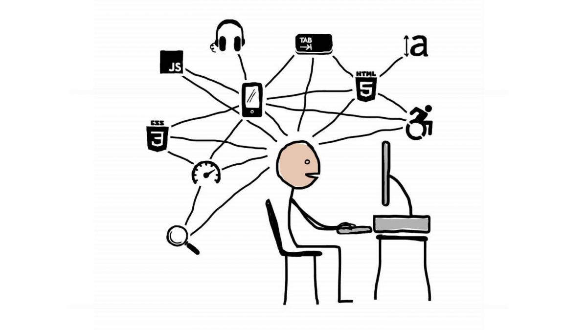
Creating user interfaces that are accessible to all users, regardless of their abilities or disabilities, is essential for ensuring that everyone has the same opportunity to interact with digital content. Here are some key considerations for designing accessible user interfaces:
- Use clear and concise language: Avoid using jargon or technical terms that may be unfamiliar to some users. Write with a clear and concise style, and make sure all content is easy to understand.
- Provide alternative text for images: Users who are blind or visually impaired may not be able to see images on a web page. Provide alternative text that describes the content of the image, so that these users can still understand the page.
- Use color contrast: People with visual impairments may have difficulty distinguishing between colors that are too close together. Use colors that contrast well with each other, and avoid using colors that are difficult to read.
- Make sure all interactive elements are accessible: All interactive elements, such as buttons, links, and menus, should be accessible to people with disabilities. Make sure these elements are large enough to be easily clicked or tapped, and use clear and concise labels.
- Use keyboard navigation: Users who cannot use a mouse may need to navigate a web page using the keyboard. Make sure all interactive elements can be accessed using the keyboard, and use clear keyboard shortcuts.
- Test your interface with assistive technology: The best way to ensure that a user interface is accessible is to test it with assistive technology, such as screen readers and magnifiers. This will help you identify any areas that need to be improved.## Creating User Interfaces with Accessibility in Mind
Executive Summary
Accessibility in user interface (UI) design is crucial for ensuring that everyone, regardless of their abilities, can interact with and benefit from your digital products. By incorporating accessibility considerations into your design process, you can create inclusive experiences that empower users and enhance the overall user experience. This comprehensive guide will explore five key subtopics in accessible UI design, providing practical tips and best practices for creating websites and applications that are accessible to all.
Introduction
In today’s digital landscape, user interfaces serve as the gateway to countless online experiences. As the internet becomes increasingly ubiquitous, the need for accessible UI design has become more apparent. Accessibility ensures that individuals with disabilities, such as visual impairments, hearing loss, or cognitive challenges, can fully engage and interact with digital content. By prioritizing accessibility, you can create interfaces that not only meet legal compliance but also foster inclusion and equity.
Key Subtopics in Accessible UI Design
1. Color Contrast
Description: Color contrast refers to the difference in brightness between text and its background. Sufficient contrast is essential for ensuring that text is legible and easy to read, especially for individuals with color blindness or low vision.
- Use high-contrast color combinations: Choose colors with a large difference in brightness, such as black text on a white background or white text on a black background.
- Check contrast ratios using tools: Utilize tools like the Web Content Accessibility Guidelines (WCAG) Contrast Checker to verify that your color combinations meet the recommended contrast ratios.
- Consider colorblindness: Design with consideration for common types of color blindness, such as protanopia, deuteranopia, and tritanopia.
2. Text Readability
Description: Text readability encompasses factors such as font size, font choice, and line length that affect the ease with which users can read and understand the content on your interface.
- Use appropriate font sizes: Select font sizes that are large enough to be easily readable, particularly on mobile devices and for users with low vision.
- Choose legible fonts: Opt for fonts that are clear and easy to read, avoiding decorative or stylized fonts that can be difficult to decipher.
- Optimize line length: Keep line lengths short to reduce eye strain and improve readability, especially for individuals with dyslexia.
3. Keyboard Accessibility
Description: Keyboard accessibility ensures that users can navigate and interact with your interface without relying solely on a mouse. This is essential for individuals with mobility impairments or visual impairments who use screen readers.
- Allow for keyboard navigation: Enable keyboard shortcuts and tab-based navigation to allow users to move through your interface without a mouse.
- Use semantic HTML elements: Employ semantic HTML elements, such as headings, lists, and buttons, to provide context and structure to your content, making it easier for screen readers to interpret.
- Provide skip links: Include skip links that allow users to bypass repetitive or unnecessary content, such as navigation menus or page headers.
4. Alternative Text (Alt Text)
Description: Alt text provides textual descriptions of images and non-text elements on your interface. This is crucial for users who cannot see the visual content, such as those with visual impairments or users who have images turned off.
- Write concise and descriptive alt text: Provide clear and informative alt text that accurately describes the image or element it represents.
- Use keyword-rich alt text: Include relevant keywords in your alt text to improve accessibility for screen readers and search engines.
- Follow best practices: Adhere to alt text best practices, such as avoiding empty alt text (alt=””) and using generic descriptions (e.g., “image of a person”) only when necessary.
5. Focus States and Visual Cues
Description: Focus states and visual cues provide users with visual feedback on which element on your interface currently has the focus. This is important for keyboard users and individuals with visual impairments who rely on screen readers.
- Use clear focus indicators: Employ visual cues, such as borders, outlines, or color changes, to indicate which element is currently in focus.
- Provide hover and active states: Design hover and active states for buttons and links to make them more accessible and intuitive to use.
- Use ARIA attributes: Leverage ARIA (Accessible Rich Internet Applications) attributes to enhance the accessibility of complex UI components and interactions.
Conclusion
Incorporating accessibility into UI design is not only a matter of meeting legal requirements but also a fundamental aspect of creating inclusive and equitable digital experiences. By understanding and implementing the key subtopics outlined in this guide, designers can create accessible interfaces that empower all users to interact confidently and enjoyably with your digital products. Remember, accessibility is not an afterthought; it should be an integral part of your design process from the very beginning. By embracing accessibility, you can create interfaces that are truly user-centered and accessible to all.
Keyword Phrase Tags
- Accessibility in UI Design
- Color Contrast and Accessibility
- Text Readability in Accessible Interfaces
- Keyboard Accessibility for Everyone
- Alternative Text (Alt Text) for Images
Thank you so much for this post! I’m a frontend developer and I’m always looking for ways to make my UIs more accessible. This post has given me some great tips that I can use in my work.
This post is really helpful, but I wish it had more information on how to test for accessibility. I’m not sure how to tell if my UIs are actually accessible to people with disabilities.
I agree with the author that accessibility is important, but I think they’re overstating the case a bit. Not everyone with a disability needs or wants to use assistive technology. And even for those who do, there are other ways to make UIs accessible besides following all of the WCAG guidelines.
This is a great post! I’m glad to see that more people are talking about accessibility. I’ve been working on making my own UIs more accessible, and it’s been a really rewarding experience.
This post is full of jargon and technical details. I can’t understand any of it. Can someone please explain it to me in plain English?
I’m not sure why you’re making such a big deal about accessibility. It’s not that important. Most people don’t have disabilities, so why should we bother making our UIs accessible to them?
I’m not a frontend developer, but I found this post really interesting. I think everyone should learn about accessibility, even if they don’t work in tech. It’s a really important issue.
This post is a great resource for anyone who wants to learn more about accessibility. I especially appreciate the section on how to test for accessibility. I’ve been using some of the techniques in my own work, and I’ve already seen a big improvement in the accessibility of my UIs.
I’m not sure what the author is trying to say in this post. Can someone please explain it to me in simpler terms?
I think this post is really important, but I wish it had more information on how to make UIs accessible to people with cognitive disabilities. I’m not sure how to make my UIs easier to understand for people with learning disabilities or ADHD.