Building Interactive Data Visualizations for the Web
Data visualization is a powerful tool for communicating information clearly and concisely. Interactive data visualizations allow users to explore data in a more dynamic and engaging way, making them a valuable asset for data analysis, storytelling, and decision-making.
Building interactive data visualizations for the web requires a combination of programming skills, design principles, and an understanding of user experience. While there are many different tools and libraries available for creating interactive visualizations, the most common approach is to use a JavaScript library such as D3.js or Vega-Lite.
D3.js is a powerful and flexible JavaScript library for data visualization. It provides a wide range of features for creating custom visualizations, including support for scales, axes, shapes, and transitions. Vega-Lite is a higher-level library that builds on top of D3.js. It provides a more declarative syntax for creating visualizations, making it easier for users to get started with data visualization.
Once you have chosen a library, you will need to learn the basics of programming in JavaScript. This includes understanding concepts such as variables, functions, and control flow. You will also need to learn how to use the library’s API to create visualizations.
In addition to programming skills, you will also need to have a strong understanding of design principles. This includes understanding how to use color, typography, and layout to create effective visualizations. You will also need to be able to think critically about the data you are visualizing and how to best represent it.
Finally, you will need to consider the user experience when designing your visualizations. This includes making sure that the visualizations are easy to understand and use. You will also need to consider how the visualizations will be used on different devices and platforms.
Building interactive data visualizations for the web can be a challenging but rewarding experience. By combining programming skills, design principles, and user experience, you can create visualizations that help users to understand and engage with data in a new way.
Here are some tips for building interactive data visualizations for the web:
- Start with a clear goal. What do you want your visualization to accomplish? What kind of data are you working with? What audience are you targeting? Once you have a clear understanding of your goals, you can start to design your visualization.
- Use the right tools for the job. There are many different JavaScript libraries available for creating interactive data visualizations. Choose the library that best fits your needs and skill level.
- Follow best practices. There are a number of best practices that you should follow when creating data visualizations. These include using consistent colors and styles, choosing appropriate chart types, and making sure that your visualizations are easy to understand.
- Test your visualizations. Once you have created your visualization, test it with real users. This will help you to identify any usability issues and make sure that your visualization works as expected.
By following these tips, you can create interactive data visualizations that are informative, engaging, and easy to use.## Building Interactive Data Visualizations For The Web
Executive Summary
Data visualization is a powerful tool for communicating information clearly and effectively. Interactive data visualizations allow users to explore data in a more engaging way, making it easier to identify patterns and trends. This article will provide a comprehensive guide to building interactive data visualizations for the web, covering best practices, tools, and techniques.
Introduction
Interactive data visualizations have become increasingly popular in recent years as a way to make data more accessible and engaging. By allowing users to interact with data, they can gain a deeper understanding of the information and make more informed decisions. This article will provide a step-by-step guide to building interactive data visualizations for the web, covering everything from data preparation to deployment.
Subtopics
1. Data Preparation
Data preparation is the process of cleaning, transforming, and formatting data so that it can be used in a visualization. This step is essential to ensure that the data is accurate and consistent, and that the visualization will be easy to understand.
- Data Cleaning: Removing errors, inconsistencies, and duplicate data.
- Data Transformation: Converting data into a format that is compatible with the visualization tool.
- Data Enrichment: Adding additional data to the dataset to provide context.
2. Choosing the Right Visualization
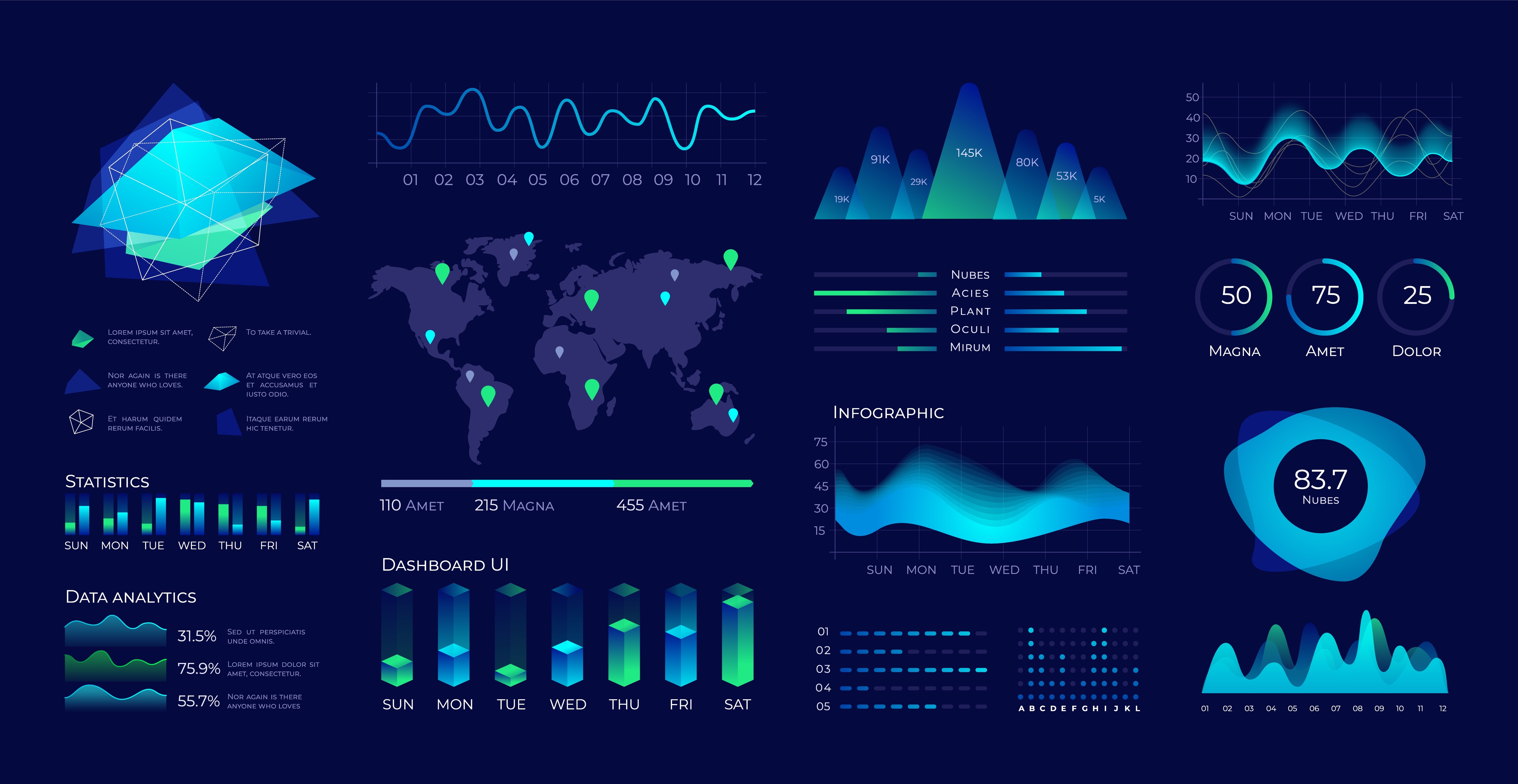
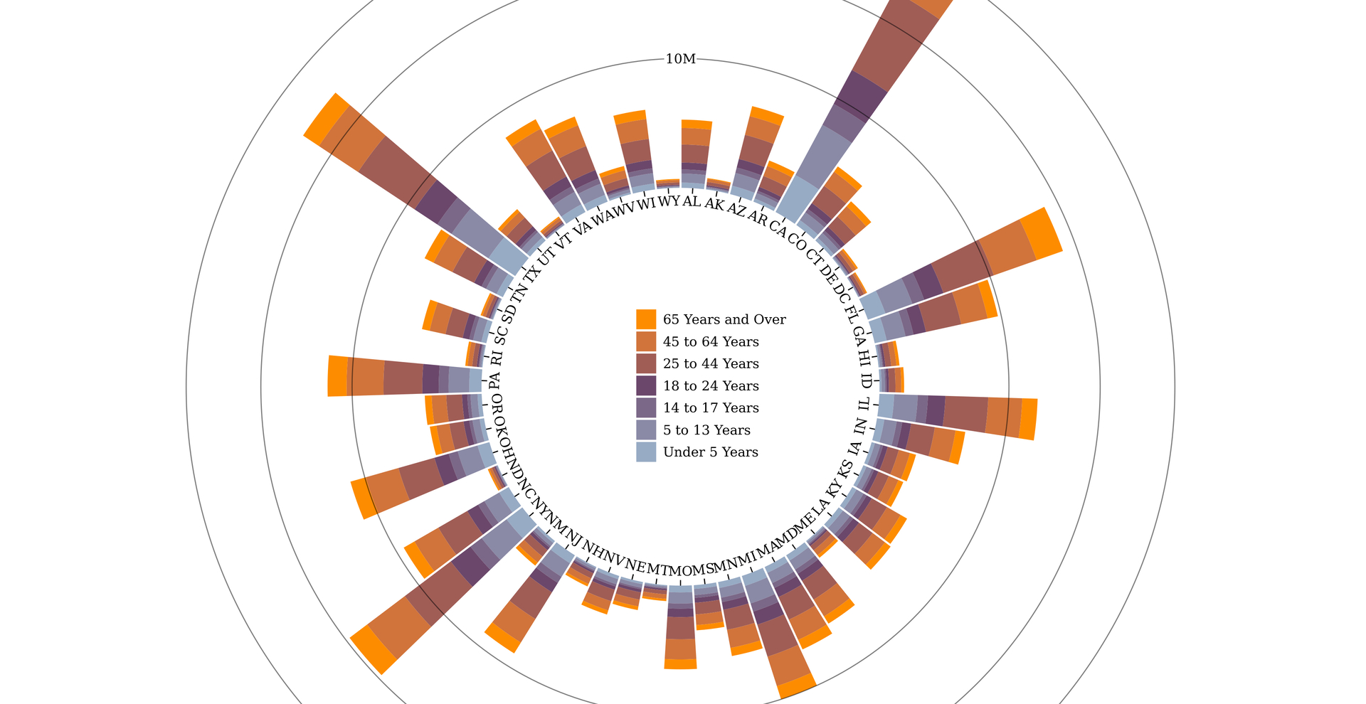
There are many different types of data visualizations, each with its own strengths and weaknesses. The best visualization for a given dataset will depend on the type of data, the audience, and the purpose of the visualization.
- Bar Charts: Displaying data as a series of bars, useful for comparing values.
- Line Charts: Displaying data as a series of lines, useful for showing trends over time.
- Scatter Plots: Displaying data as a series of points, useful for identifying correlations.
3. Designing the Visualization
Once the data has been prepared and the visualization type has been selected, it is time to design the visualization. This step involves choosing the colors, fonts, and layout of the visualization.
- Color: Using color to encode data effectively, avoiding color blindness issues.
- Typography: Selecting fonts that are easy to read and visually appealing.
- Layout: Arranging the different elements of the visualization in a logical and visually appealing way.
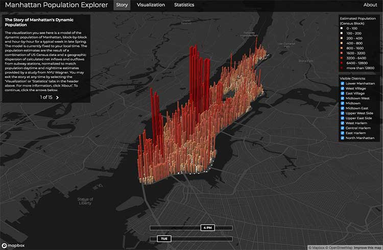
4. Adding Interactivity
Interactivity is what makes data visualizations truly engaging. By allowing users to interact with the visualization, they can explore the data in a more granular way and gain a deeper understanding of the information.
- Filters: Allowing users to filter the data by specific criteria.
- Zooming: Allowing users to zoom in on specific areas of the visualization.
- Tooltips: Providing additional information about specific data points.
5. Deployment
Once the visualization is complete, it needs to be deployed to a web server so that it can be accessed by users. There are several different ways to deploy a visualization, including using a static file server or a content management system.
- Static File Server: Hosting the visualization files on a server and providing a URL to access them.
- Content Management System: Using a CMS to manage and publish the visualization.
Conclusion
Creating interactive data visualizations for the web is a powerful way to communicate information clearly and effectively. By following the steps outlined in this article, you can create visualizations that are both informative and engaging.
Keyword Tags
- Interactive Data Visualization
- Web Development
- Data Visualization Tools
- Data Preparation
- Data Analytics